CS422 - Response on critiques from groups 7 & 8
GROUP 3 (Marco, Arunan, Vijay)
Links -> | Before.ppt | Critiques.txt | After.ppt | Revised Design in PDF
Discussion
The screensaver:
Group 8(Mandeep and Ben)
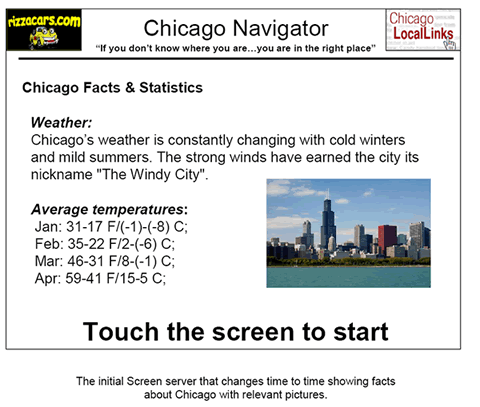
The
display that shows the average temperatures is very crowded and not easy to
read or understand. If you wish to inform the user of the average temperatures
of Chicago, do it in a more organized way (maybe in a form of a table) and
avoid making the user strain to read it. Instead of displaying the Fahrenheit
and Celsius temperatures separated by a slash with no blank space, leave some
more space between the two sets of temperatures. Also, by looking at the screensaver
the user won’t be able to tell that he can use it to find more information
than just Chicago statistics, so it would
be helpful to let the user know that they can get more information by touching
the screen.
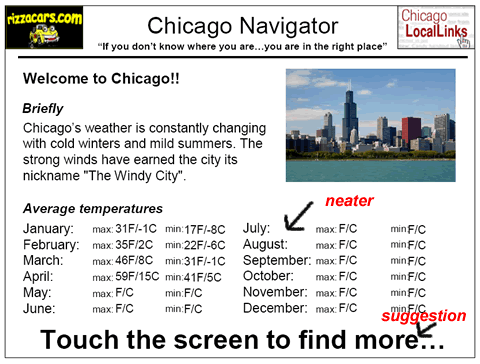
Group 7(Ausmann, Czajkowskyj, Pro)
First the screen saver was very informative. It makes good use of down time, time when no one is using the screen. However this tends to make it look like a display just for the screen saver information. It needs to be clear what the machine does (while in screen saver mode) and that a user should come up to it and start using it if they want certain information.
Changes made: Neatly arranged temperature stats, Bigger font on "Touch screen to... ", "Find more" instead of "Start" in the instruction to let users know they can get more information out of the kiosk.
Before After
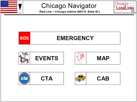
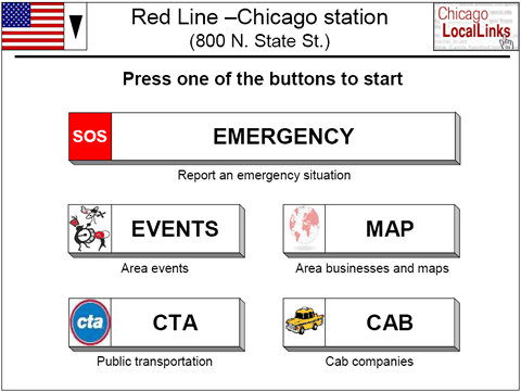
Main Screen:
Group 8(Mandeep and Ben)
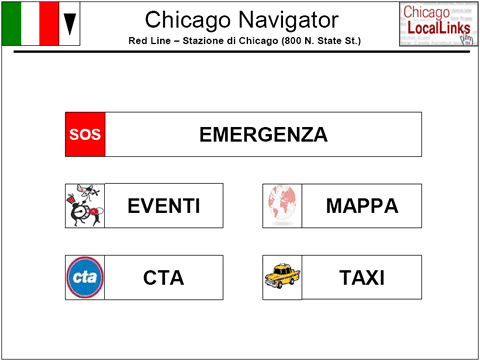
By looking at the main screen, the user won’t be able to tell that they can find information about local establishments since there is nothing indicating that. If the user doesn’t really need a map, but would be interested in looking at menus of local restaurants, they won’t be inclined to go into the map option and thus never know that menus are available through this touch screen.
Group 7(Ausmann, Czajkowskyj, Pro)
For the first screen, the one that has all the options for where you want to go within the system, it is not overly intuitive. The map feature is the one that will show directions and what restaurants are available to visit. This isn’t apparent to the user with the current design. Similarly if a user wants to look up a location of a restaurant or someplace to visit that isn’t apparent either.
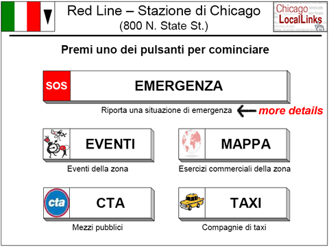
Changes made: More suggestive buttons, details under buttons, "Press buttons to start" generic instruction....
Before After
For people with difficulty in deciphering ITALIANO..
Before After
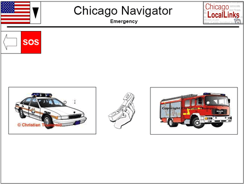
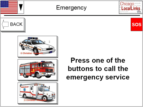
Emergency Screen:
It might be helpful to include an option to call for an ambulance as well as the police and fire department.
Change made: added ambulance option.
Before After
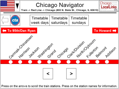
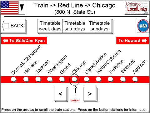
Train Station Screen:
Group 8(Mandeep and Ben)
In
the screen, it is not clear where exactly the user has to push to get information
about the station: the label reads “Press on the station names for information”,
however the station names don’t look like buttons, instead there are little
white circles that sort of look like buttons. The user will be confused by this
inconsistency of the label saying Press on station names but the buttons look
like they are located just under the names.
Group 7(Ausmann, Czajkowskyj, Pro)
The train schedule looked very slick. The only question lingering on that part was does the user get every train stops schedule if it is clicked? If so that’s great, if not that might be a feature worth looking into adding.
changes: The buttons on the station names have been made more suggestive. And, we had a screen which showed a small area around the station, schedules can be added to that screen too.
Before After
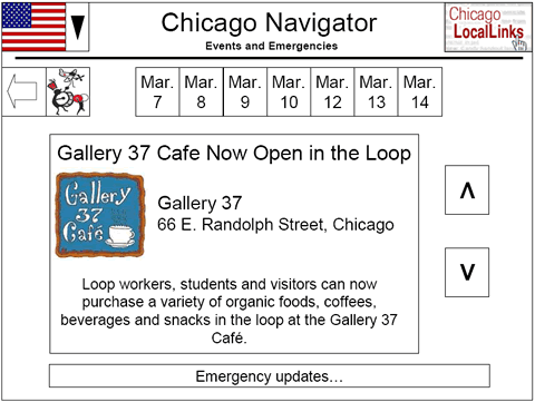
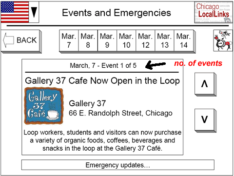
Events:
Group 7(Ausmann, Czajkowskyj, Pro)
On the events page there is some slight work that can be done to notify the user of how many events are actually going on in the area. Currently the user can go up and down through many events without really knowing where the user is within that list of events. This can get problematic if you have the whole year’s worth of events in that list!
" ...exists for the restaurant/event description up and down arrows. The user can scroll without knowing how much information is left to view."
Group 8(Mandeep and Ben)
Instead of the label Week, specify that it corresponds to Current Week because the user might think that they can use the general Week option to pick any week they are interested in finding events for.
Changes made: The no. of events/places/restaurants etc. that are left are displayed on top of the event advertisement and respective windows.
Before After
General comments / Other Comments
Group 8(Mandeep and Ben)
Map Screen: The icon used for the banks button doesn’t really clarify to the user that this button is for the banks option i.e. looking at the icon of money could mean ATM’s and not necessarily banks. Same thing for the exchange rates icon, the meaning is not implied by looking at the icon, so I would suggest using better icons or maybe some text for clarity.
I noticed that the background color of the map is the standard google map color but when you zoom in to the streets, the background is white. I would keep the color the same so the map is consistent whether you zoom in or out.
Finally, for all the screens, the icons next to the back button makes it look like pressing the back button will take the user to a location specified by the icon. Since this is not the case, I would change that particular layout.
ANSWERS:
a) We will be working on making the icons look better during the implementation phase.
b) The maps will be of the same color in every screen in the implementation.
c) All the screens have been modified to have the longer " BACK <= " button on the left and the icon for that particular screen in the far right.
Group 7(Ausmann, Czajkowskyj, Pro)
The appearance is very clean. The use of a white background overall along with white background buttons was a clean implementation. Maybe this is too plain looking, if so try a different color scheme, especially for the buttons so that they stand out better and grab a user’s attention. It also seems that there is almost too much white space, which is empty space where there are no controls. Give your controls a larger proportion of the screen so that the user can play with them.
ANSWERS:
a) We have tried using buttons (shadowed and 3D looking) to improve the controls(thereby giving more space and reducing whitespace).
b) We have added some details below controls to reduce whitespace and give additional instructions to the user to lead him/her to the right place.
Thank you!
MARCO BERNASCONI
ARUNAN RABINDRAN
VIJAY KRISHNAMOORTHY